<h1>
Youth Now Canada
</h1>
<p>
Youth Now Canada is an organization with a mission of “assisting children and youth by enhancing their own strengths and resiliency.” The project scope included merging the Youth Now Canada and the Youth Now Farm’s websites and strengthening their branding to make it unified and professional.
I came upon this project during my time working as a SLiDE/IBM Intern at Algonquin College. In the Social Innovation Lab, our mission was to use our skills to work within the community to create change.
This project was developed in a team of three. Working alongside my colleagues Wilfred Turcotte and Mohamed Akel, we created a modern redesigned WordPress website.
</p>
*This site/design was created in a collaborative workspace with my team members at SLiDE. Wilfred Turcotte is the team lead, and Mohammed Akel is a co-developer.
Redesign Website
Increase Engagement
Encourage Support

<p>
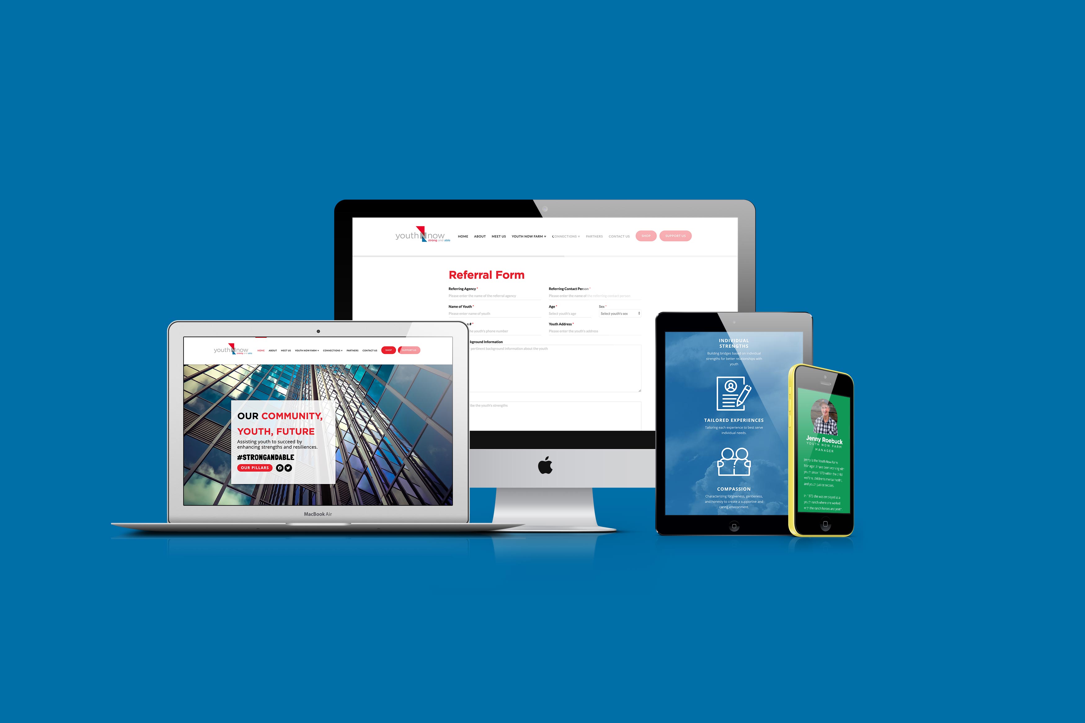
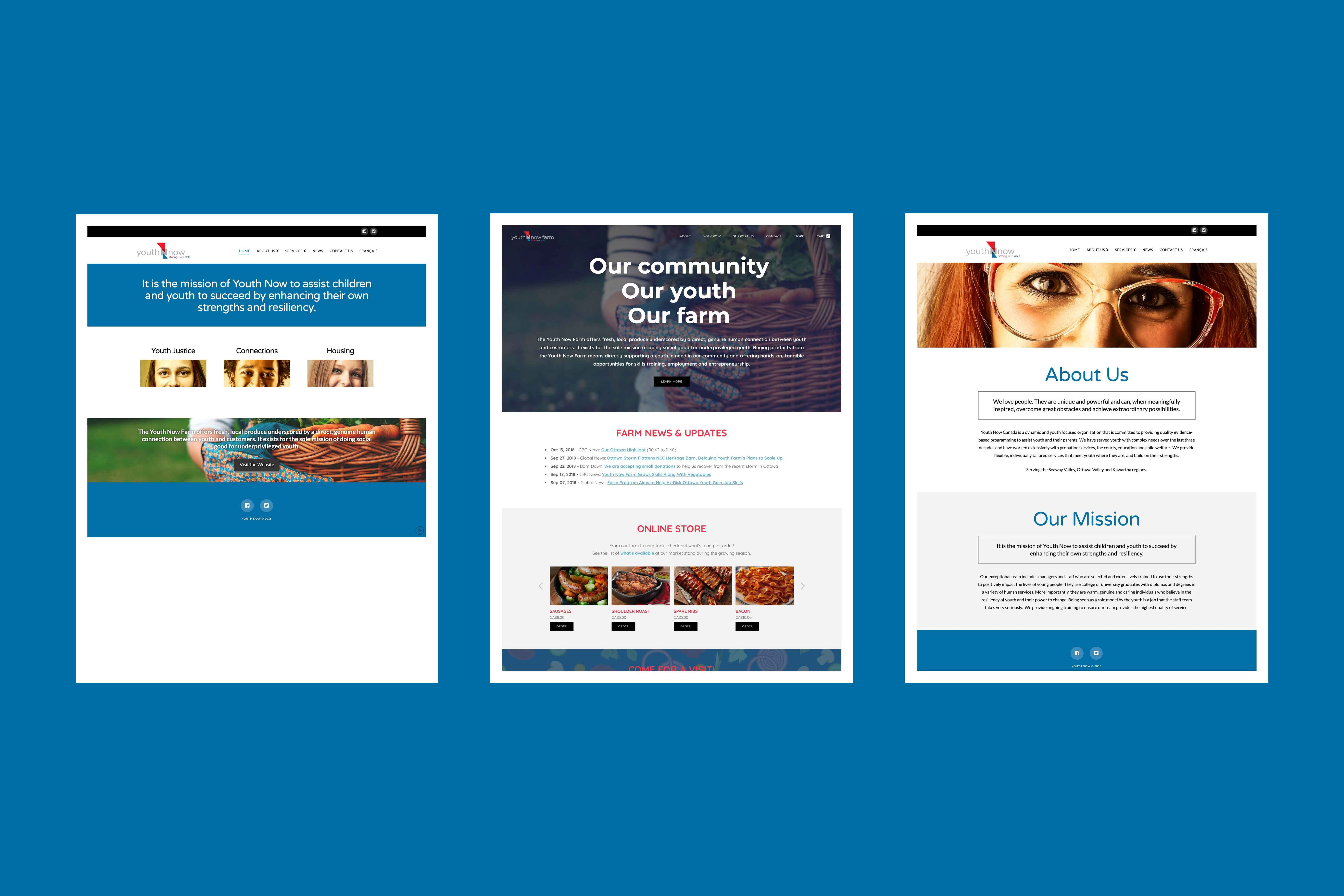
The goal of this website redesign is to: recreate the website to have more effective content by strengthening the branding with stronger graphics and design and redesigning the online store.
The secondary goal was to increase engagement with the online content from the user perspective. This included developing an accessible website with an easier navigation system.
</p>
<p>
The primary target audience consists of an age range between 40-60 years old. The primary age groups consist of sponsors, and people who will donate.
</p>
<p>
In terms of concepts, we had to approach this project differently as the brand was already created and we had to follow the branding guide that was set in place. Through consideration of the past website design, we took the elements and recreated them to be more effective and speak the brand of Youth Now.
</p>
<p>
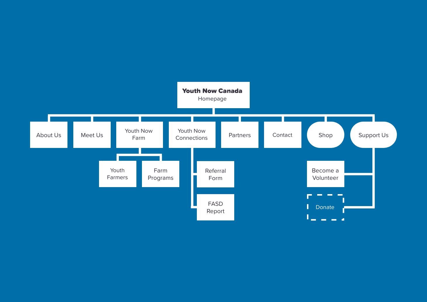
Through user testing and research, we determined that the original sitemap was not very effective. The users got lost in the website easily, as the navigation was organized inconsistently. We decided to move forward by creating the simplest sitemap we could with the given content. We wanted to highlight the Shop and Support functionality, so we decided to make those into bold buttons to draw the user's attention.
</p>
<p>
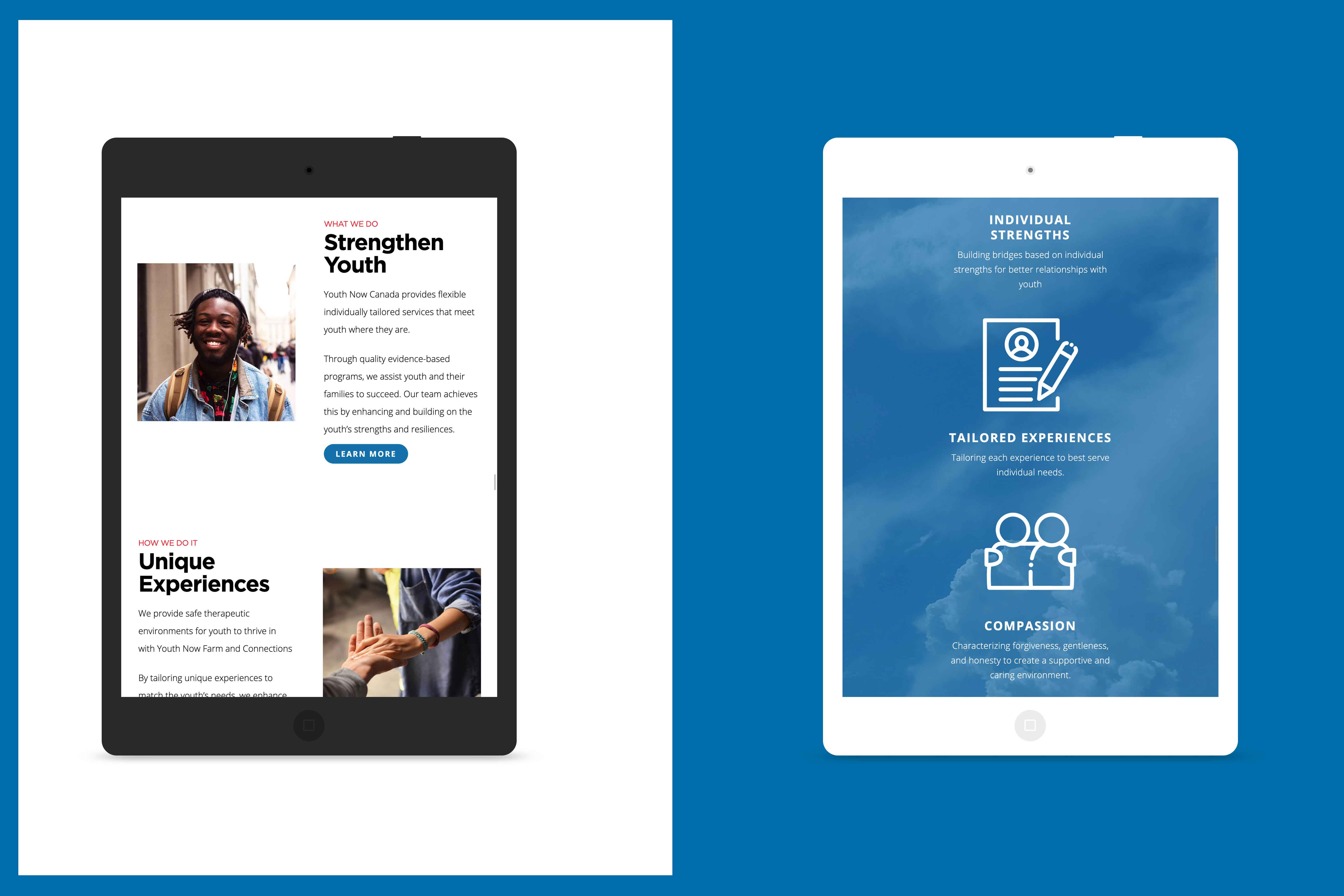
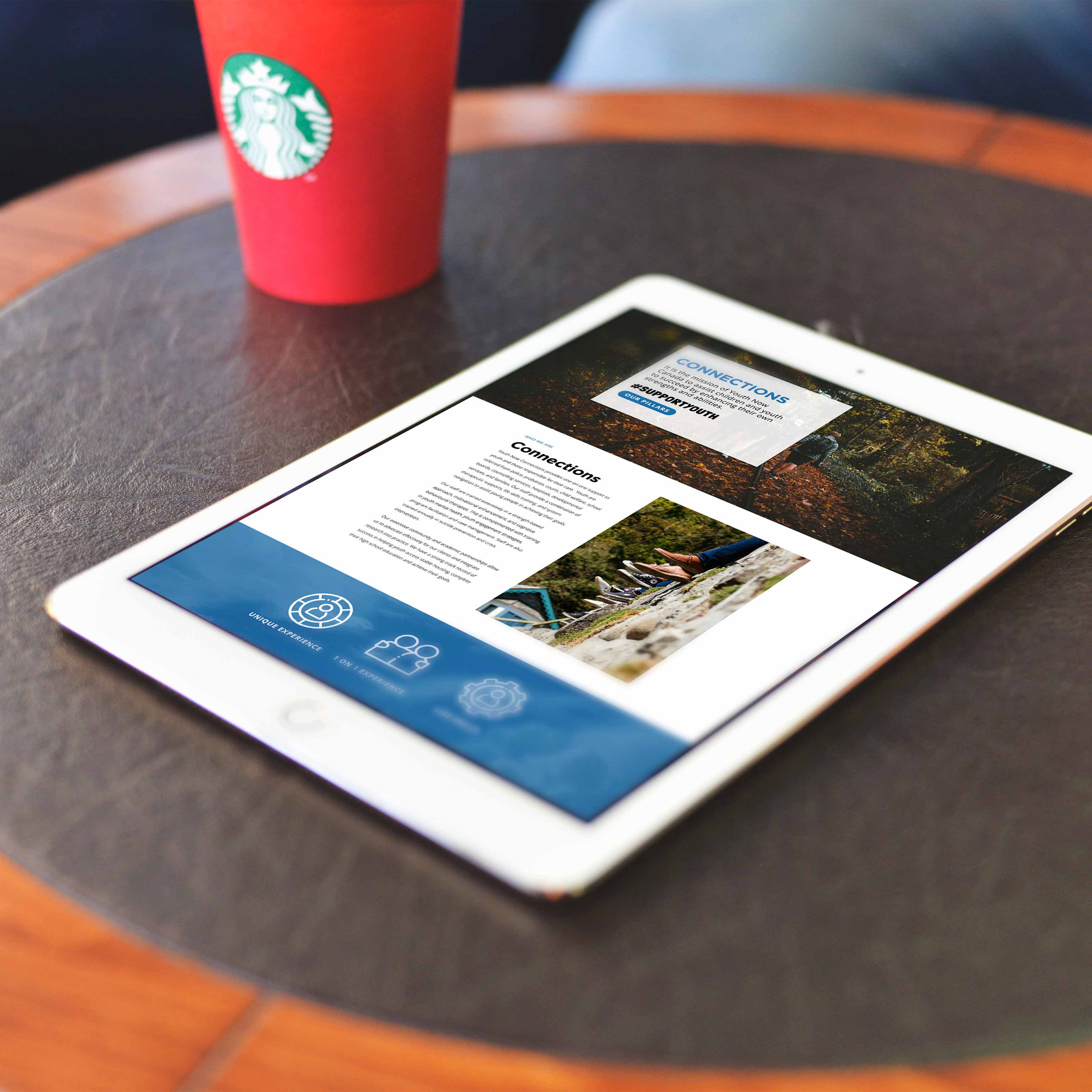
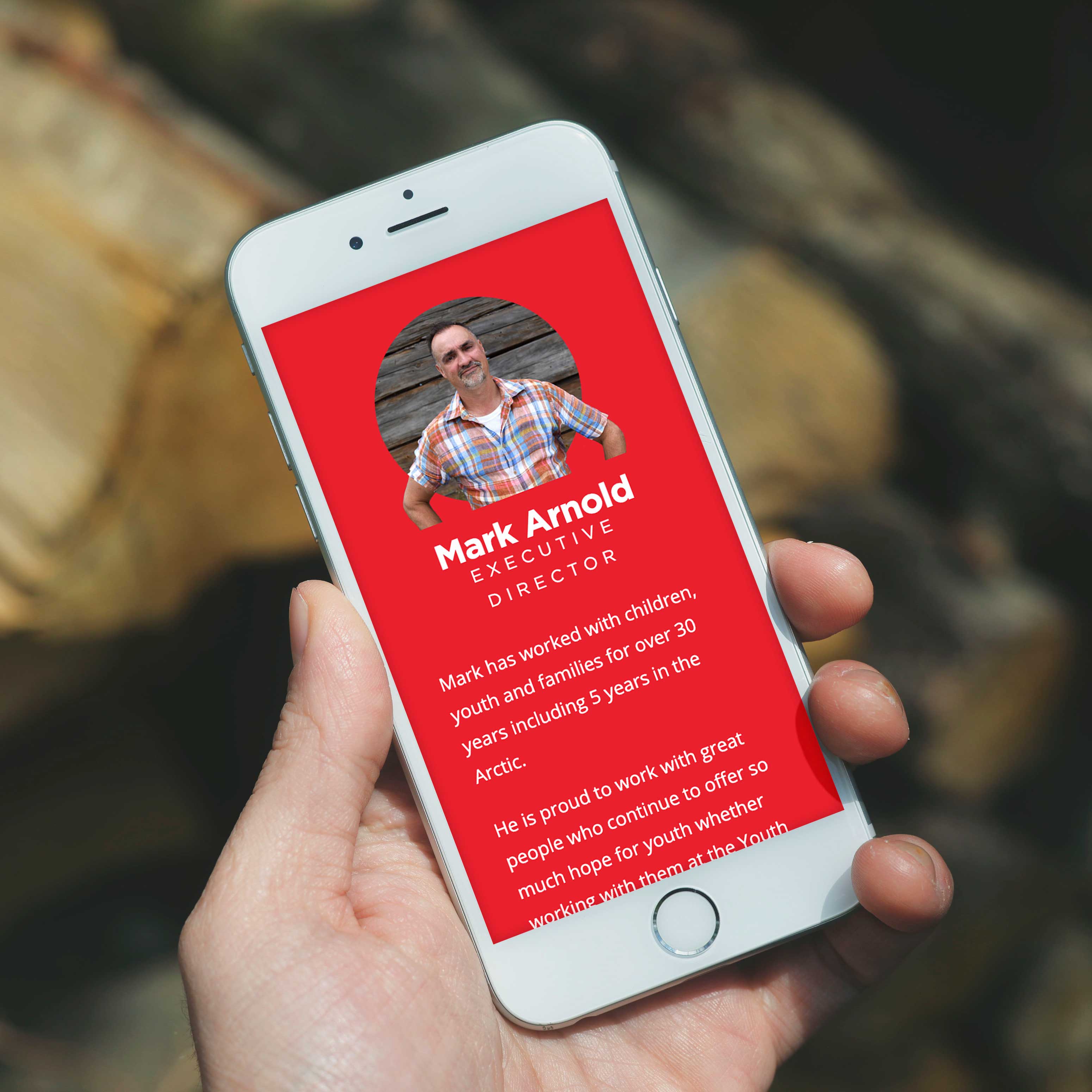
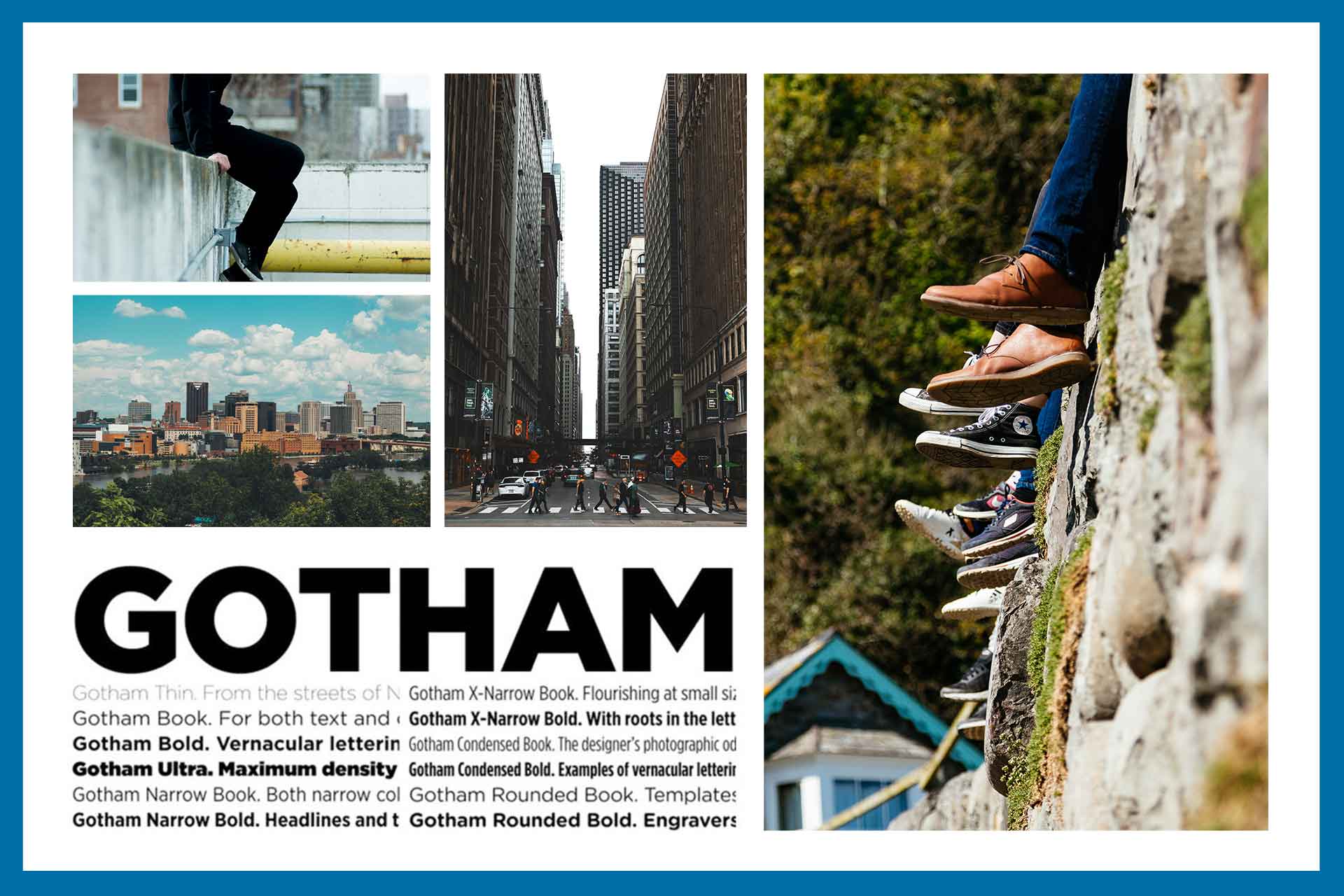
In terms of design, we followed a minimalist layout that highlights photography and text content. All the imagery chosen focused on youth and skill development. We wanted to showcase the brand as being authentic to its purpose and focus on the growth of youth.
</p>
<p>
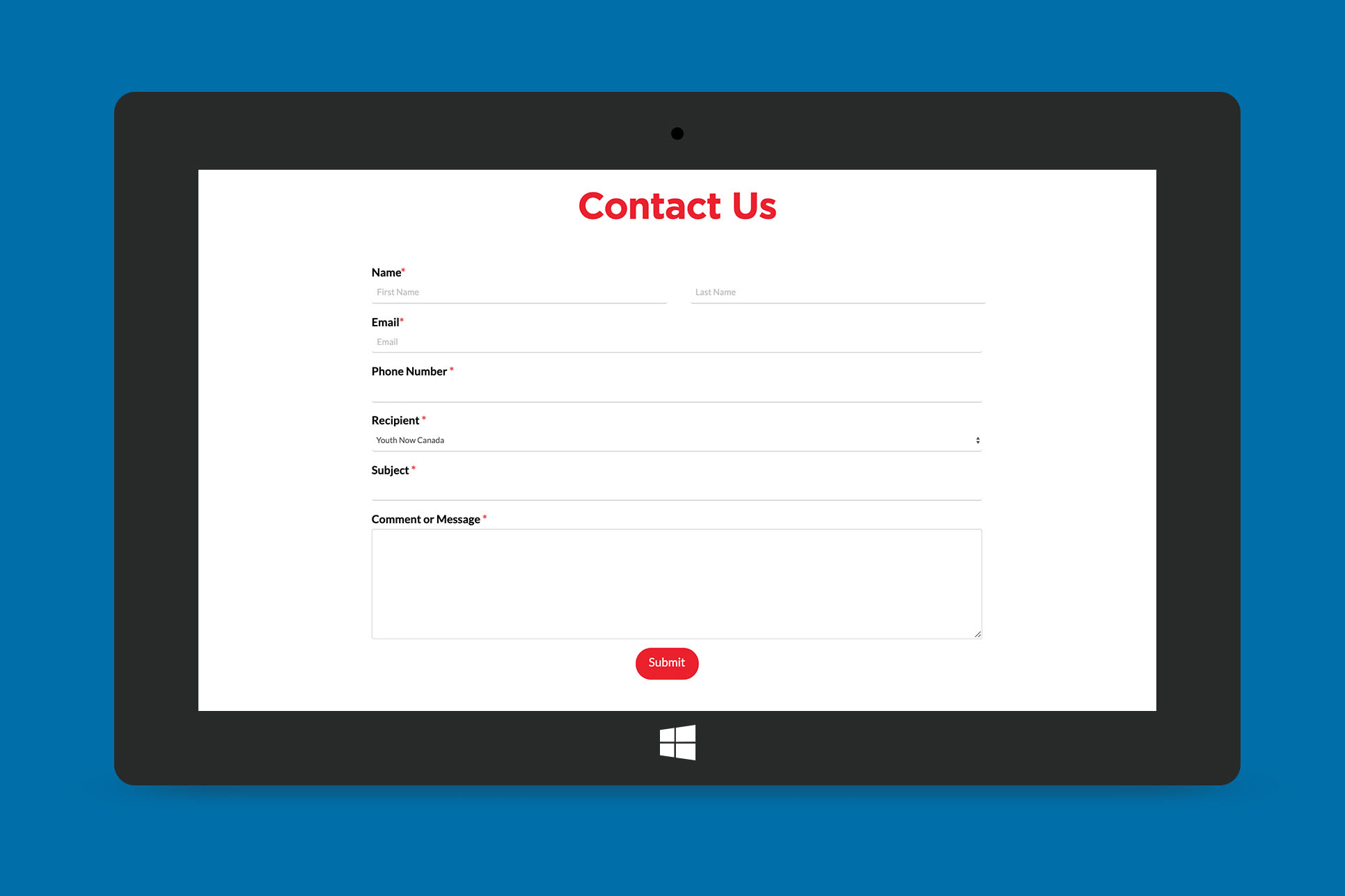
The first step of designing the wireframes included looking at the original website design and layout. We incorporated aspects of the original website (shown in the first image) by using similar colours, typography and content. Every other aspect was overhauled as we completely redesigned the interface to create a modern layout that would reach a greater target audience. My work focused on the design of website elements including banners, buttons, cards and iconography. I also updated the form design.
</p>
<p>
Development began on Wordpress for this project. The first stages started with researching into how to work with ThemeX alongside Elementor. We found multiple plug in's that could be compatible with both page builders and began to create each page individually. We went through an extensive process of testing and troubleshooting as we were working with multiple digital platforms.
</p>
<li>
I was able to develop my skills by:
- • developing on a CMS platform
- • working on ThemeX
- • using the Elementor page builder
- • working with plug in's
- • designing page layouts
- • creating custom iconography
- • handing off work to teammates
</li>
<p>
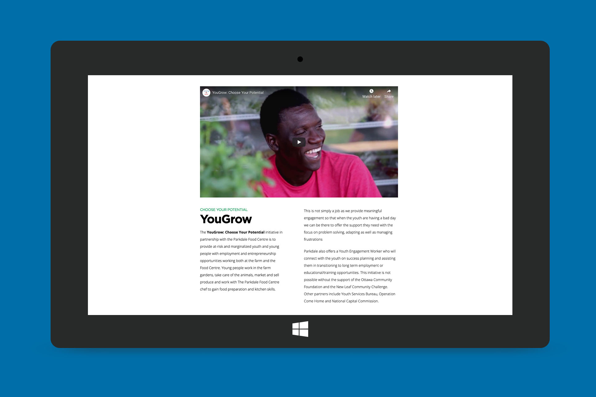
My focus was on the overall layout and design elements. Working with templates and by being able to customize the CSS, I was able to develop effective and responsive elements to use throughout the website. I worked with the Elementor page builder to build out the pages and patterns including headers, banners, text sections, cards, and forms. Using WPForms, I was able to customize the form fields, then I used CSS to change the look of the form. I designed the shop's main page, and chose the food imagery to match alongside the brand.
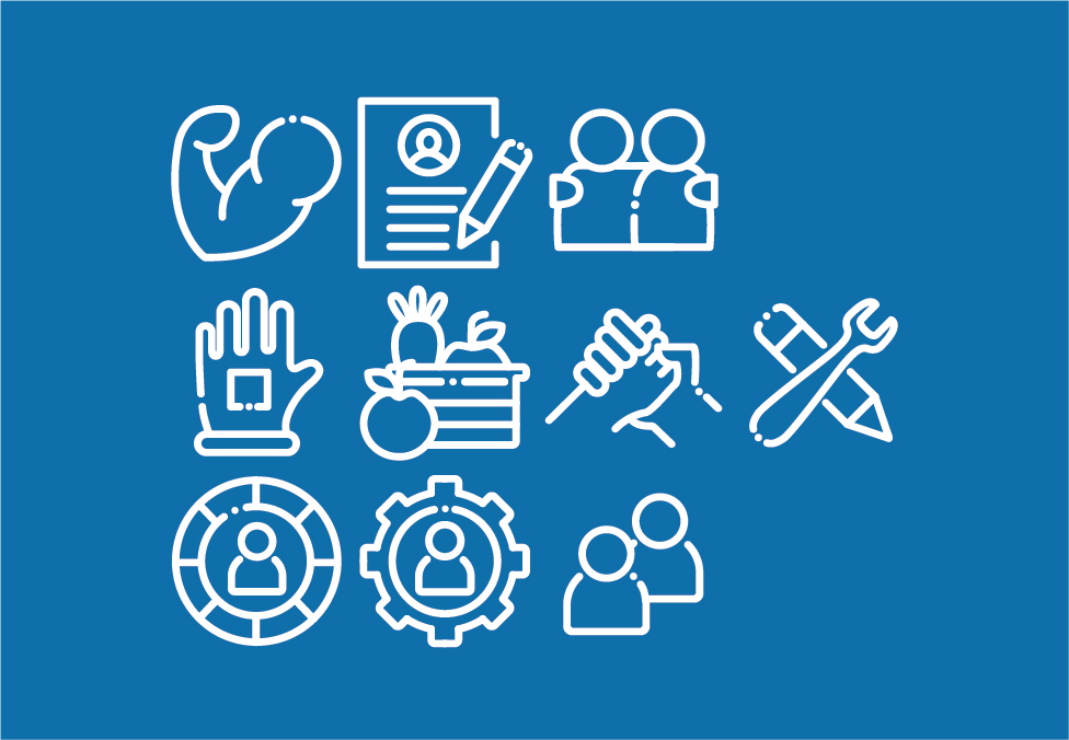
The icons I developed were to represent the pillars and purpose of the programs that Youth Now developped including the Youth Now Farm and Connections programs. These programs have a focus on helping at-risk or underprivileged youth build experience and skills in the workplace. Using the iconography was an asset as it is an effective visual method to show what the goal of the programs would be.
Working in a collaborative setting for this project is a highlight as I feel that I gained more knowlegde than what I had come into the project with. I learned valuable skills from working alongside my peers which I use in my future work.